Living Brand Guide · v2.1 · 2026-06-04
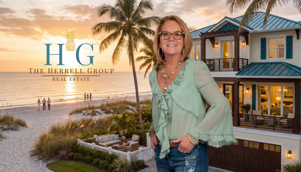
The Herrell Group
Welcomes You Home
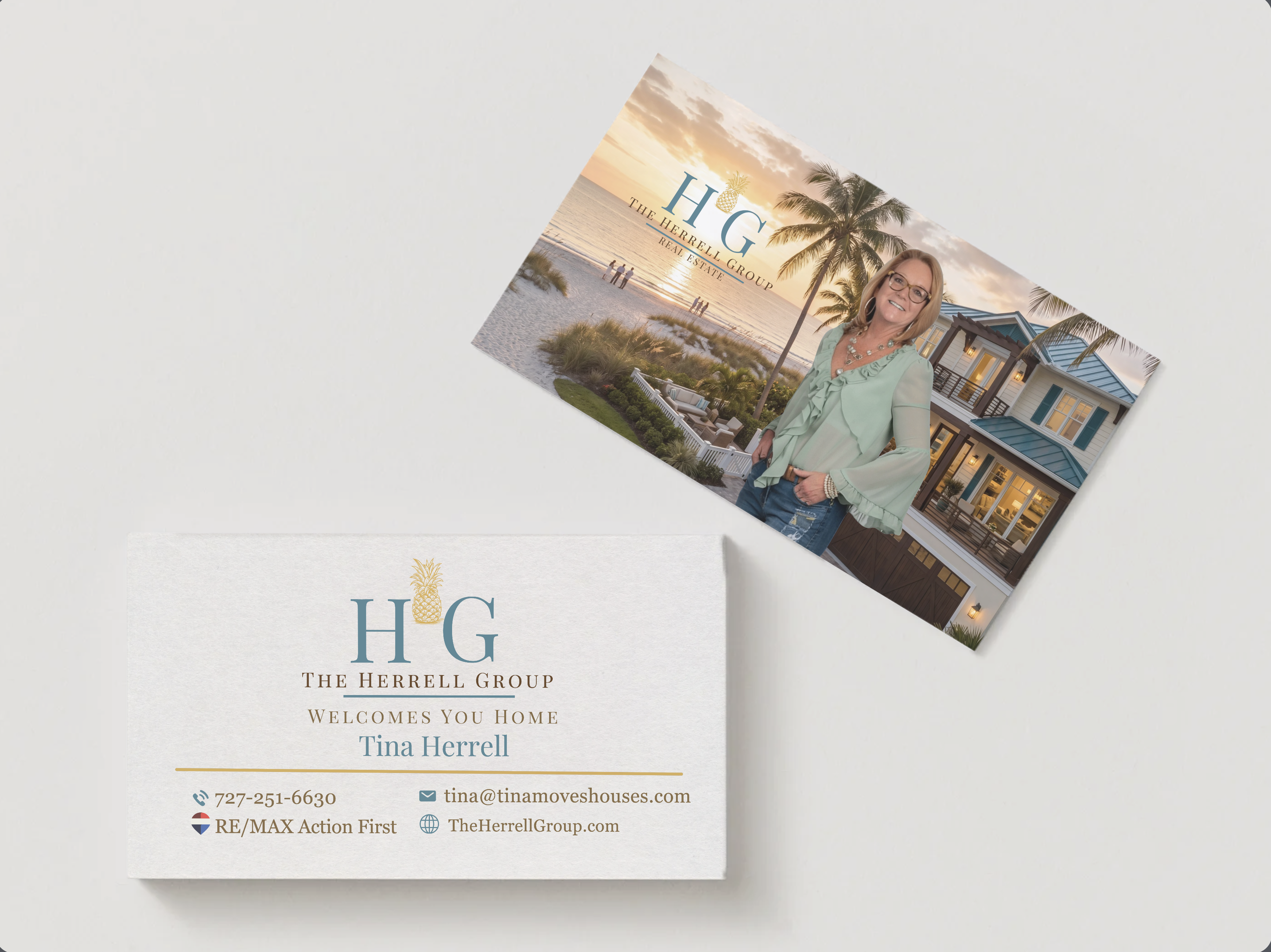
Tina Herrell · Waterfront Real Estate · St. Pete Beach & Pinellas County
01 · Foundation
Family-first real estate, built on forty years in Pinellas.
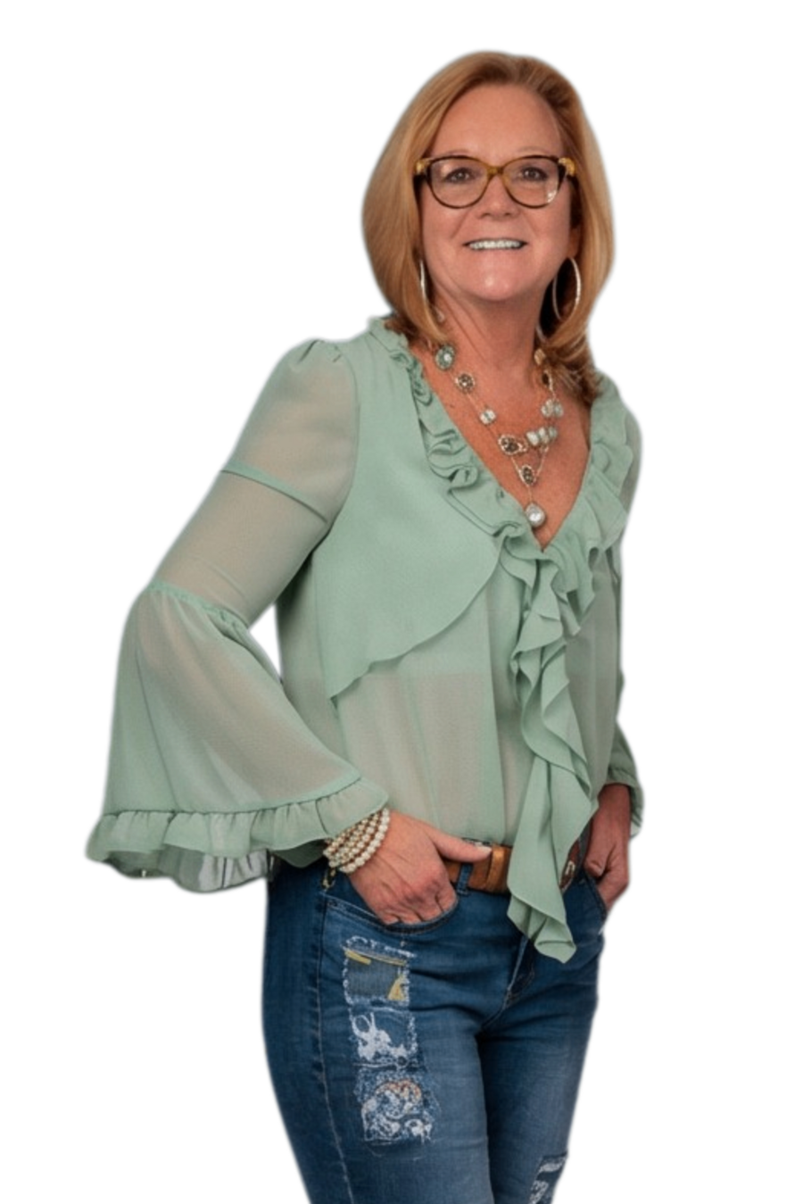
The Herrell Group is Tina Herrell — a Pinellas County resident of four decades who treats every client like family and every closing like the start of a longer relationship. Calm under pressure, exact on the details, and rooted in the coastal communities she sells.
Who the Group is
Tina Herrell: 40+ years in Pinellas, RE/MAX since 2012, Hall of Fame, Luxury Home Marketing designation. Co-owner of a Pinellas construction company for 25+ years — she reads a home's bones, not just its finishes.
Who it serves
Waterfront and coastal buyers and sellers across St. Pete Beach, Belle Vista, Gulfport, Treasure Island, and St. Petersburg — including the $1M+ tier that wants discretion and a deliberate marketing plan, not foot traffic.
Who it isn't for
Out-of-market agents' overflow, transaction-only shoppers who want a faceless service, and sellers who want hype over a strategy. The Herrell Group is a relationship, not a vendor.
Personality
Six words carry the brand: Florida lifestyle, professional, warm, a servant heart, calm, family. Everything the brand says and shows should pass through those six.
02 · The Symbol
There's a reason for the pineapple.

Some people walk into a house and just know. The light through the window. The way the door sounds when it closes. The quiet feeling that says you could be at home here. That moment is the whole job.
Tina's family is from Sweden; her father was the first born here in America. In their family, the pineapple has always meant welcome — set where guests arrive, to tell them they were wanted, expected, and cared for. A tradition that crossed an ocean and stayed.
That's the meaning the brand carries into the work. Not just selling homes: helping people feel the moment of arrival. The exhale. The sense that you're finally home.
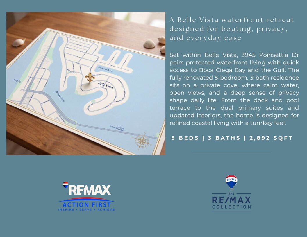
The gold pineapple rises at the center of the H·G monogram, so the welcome sits at the heart of the name. On a listing map it becomes the pin — the welcome marks the spot. It stays because the promise behind it never changes.
The brand in one phrase, true to where it came from: Welcome home.Tina's family story, in her words. The source of the symbol — not invented lore.
03 · Logo System
One mark, five jobs.
The H·G monogram with the gold pineapple is the primary mark. File naming: herrell-[variant]-[treatment].svg.
Primary (stacked)
The full lockup with "Real Estate." Covers, hero headers, listing flyers, signage.
Download PNG
Horizontal
Email banners, website header, document headers. The "Welcomes You Home" variant lives here.
Download PNG
Reversed
Gold + white on Bismark Teal or Ink — the dominant treatment in current materials.
Download SVG
Gold reversed (stacked)
All-gold monogram with white wordmark. For dark grounds — Bismark Teal, Ink, or deep photography.
Download PNG
Gold reversed (horizontal)
The horizontal lockup reversed for dark grounds — email footers, signage, dusk photography.
Download PNGClear space & minimum size
Clear space = the height of the pineapple crown on all sides. Minimum size: stacked lockup 180px / 1.5in; horizontal 280px / 2.25in; symbol 32px / 0.5in. Below 64px, use the pineapple symbol alone — never the full lockup.
Don't
Don't recolor the pineapple (it is always Equator gold). Don't place the gold logo on cream (fails contrast — reverse to teal or use Ink). Don't stretch, add effects, or pair the mark with a second script face.
04 · Color & Accessibility
The coastal palette, locked and contrast-checked.
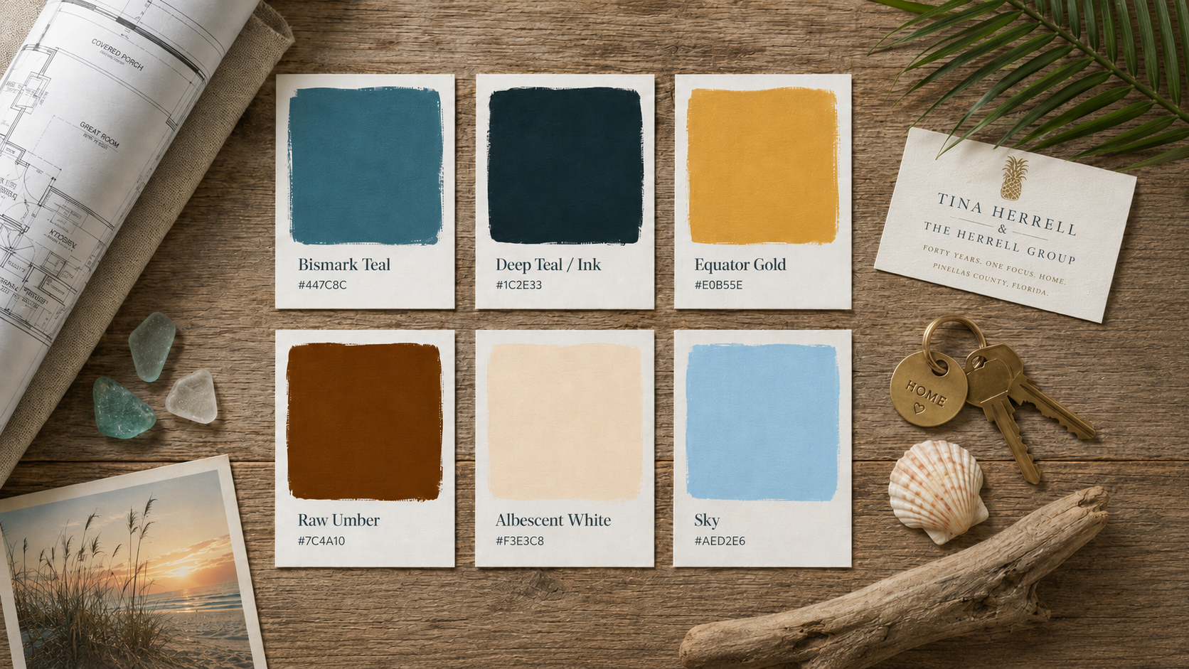
Six paint chips on Gulf Coast driftwood — the coastal palette as it lives in the field. Tap any hex to copy.
Usage ratio
Lead with teal, spend gold sparingly. Bismark Teal 50% (grounds and bands) · Cream + white 28% (surfaces and reading) · Deep Teal / Ink 12% (text) · Equator Gold 8% (accent and the pineapple) · Sky 2% (rare highlight). If gold is doing more than 10% of the work, it has stopped being precious.
Pairings matrix
Ratios for the locked palette (WCAG: body ≥4.5:1, large/bold ≥3:1). The 2024 guide had no matrix — this is the addition that makes the brand safe to apply at scale. Recompute if a token changes.
| Foreground | Background | Ratio | Use |
|---|---|---|---|
| Deep Teal / Ink | Albescent / Paper | 11:1 | Body ✓ |
| Raw Umber | Albescent / Paper | 5.9:1 | Body ✓ |
| White | Bismark Teal | 4.7:1 | Body, reversed ✓ |
| Equator Gold | Deep Teal / Ink | 7.4:1 | Body, reversed ✓ |
| Bismark Teal | Albescent / Paper | 3.7:1 | Headings / large only |
| Equator Gold | Bismark Teal | 2.4:1 | Large display / logo only |
| Equator Gold | Albescent / cream | 1.5:1 | Never text — decorative ✗ |
Usage
Bismark Teal is the brand ground — lead with it. Gold is the single accent and the pineapple; treat it as precious, never as body text. Body copy is Deep Teal/Ink on cream, or white on teal when reversed. Sky is a quiet highlight only. Never set gold type on cream.
05 · Typography
The Seasons. A signature script. Georgia.
A Didone display for headlines and the overlaid captions on photography; a script reserved for signature moments; Georgia for everything that has to be read.
| Role | Face | Size | Weight | Tracking / case |
|---|---|---|---|---|
| Display / H1 | The Seasons | 48–72px (3–4.5rem) | 500 | +0.01em · Caps |
| Header / H2 | The Seasons | 30–40px (1.9–2.5rem) | 500 | +0.01em · Caps |
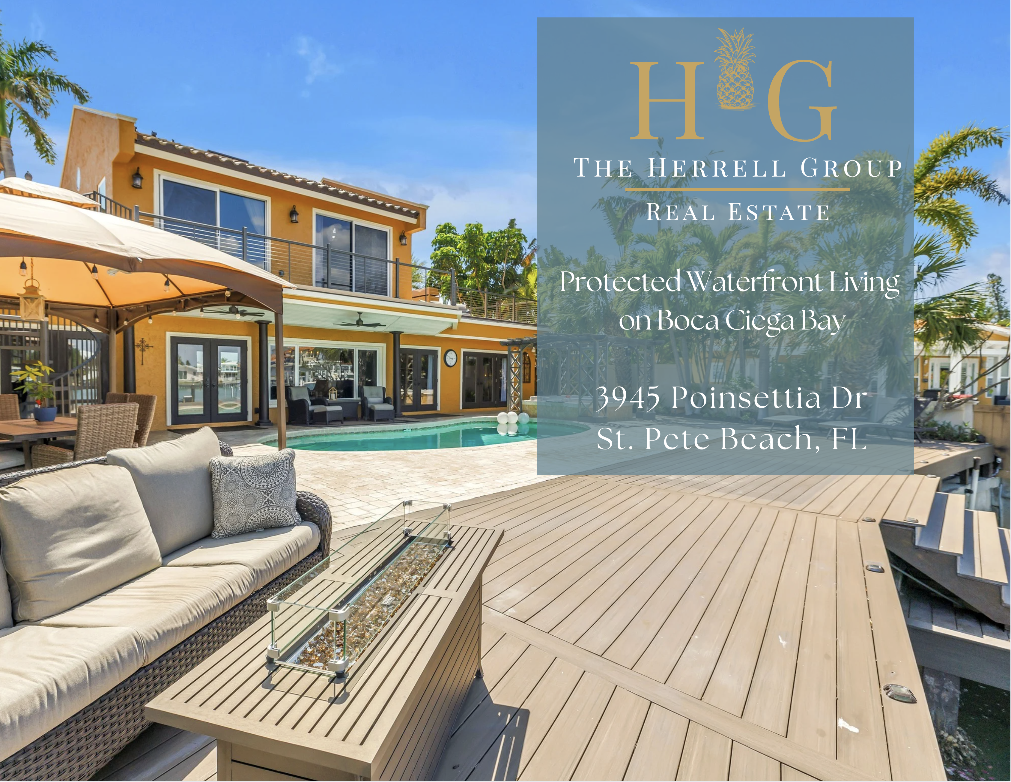
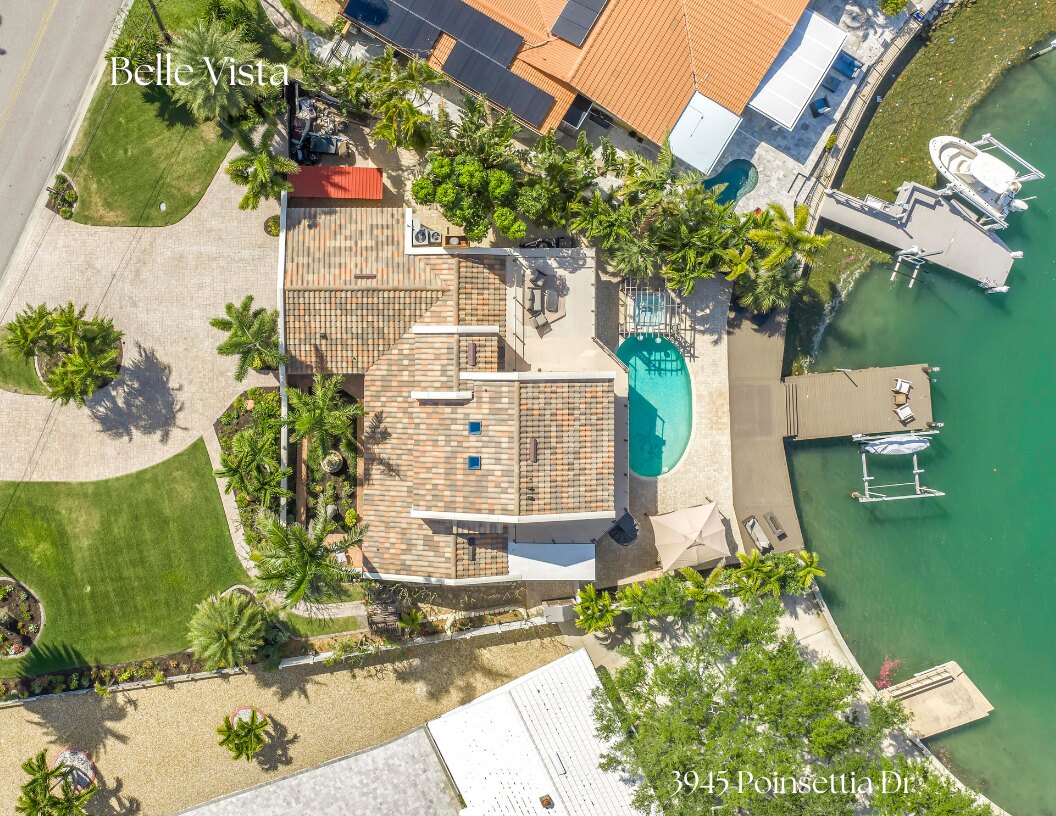
| Photo overlay | The Seasons | 28–40px | 500 | White, one caption per image ("Belle Vista") |
| Subhead / H3 | Georgia Pro | 18–22px (1.1–1.375rem) | 700 | 0 · Mixed case, never all caps |
| Signature / accent | The Something Script | 28px+ | 400 | "Welcomes You Home", sign-offs. Never body or headline. |
| Body | Georgia Pro | 10–12px (1rem) | 400 | 0 · line 1.5–1.65 · left · max 66ch |
| Eyebrow / caption | Georgia Pro | 12px (.75rem) | 700 | +0.24em · Caps |
Rules: headers in capitals; subheads mixed case, never all caps; the script is the only script in the system — never pair it with another. Licensing: confirm web-embedding rights for The Seasons and The Something Script, or ship licensed web equivalents (Playfair Display + a script). Georgia is a system font — safe everywhere.
06 · Voice & Copy
Calm, specific, and confident. Never hype.
Lead with what's working, not with caution. Prove it with specifics a buyer could verify on a walkthrough. The home speaks for itself; the brand never shouts.
Say
- "Welcomes you home."
- "Message me to walk it in person."
- Name the spec: "12,000-lb Deco lift," "TimberTech decking," "porcelain tile."
- "Protected waters at home. Open Gulf access within minutes."
- Place names: Belle Vista, Boca Ciega Bay, St. Pete Beach.
Don't say
- stunning · luxurious · must-see · dream home · opportunity
- "Don't miss out!" / urgency tropes
- "still" ("buyers are still active") — state activity as fact
- seamless · world-class · turnkey-as-filler
- Generic AI real-estate tone ("steeped in elegance and timeless charm")
Copy deck
One-liner
The Herrell Group welcomes you home.
Boilerplate · 50
The Herrell Group is Tina Herrell's waterfront real estate practice on Florida's Gulf Coast. Four decades in Pinellas, a builder's eye for a home's bones, and a family-first approach to every client — from first showing to final closing, and the years after.
Boilerplate · 100
The Herrell Group is the waterfront real estate practice of Tina Herrell, serving St. Pete Beach and the Gulf Coast communities of Pinellas County. A resident of four decades and co-owner of a 25-year local construction company, Tina reads a home's bones as clearly as its finishes. She represents buyers and sellers — including the luxury tier — with calm expertise, discretion, and a family-first approach that treats every closing as the start of a longer relationship. The brand's promise is its symbol: a pineapple, the family's sign of welcome. Welcome home.
Boilerplate · 200
The Herrell Group is the waterfront real estate practice of Tina Herrell, serving St. Pete Beach, Belle Vista, Gulfport, Treasure Island, and St. Petersburg. Tina has lived in Pinellas County for more than forty years and has sold here since 2012, earning the RE/MAX Hall of Fame and a Luxury Home Marketing designation. With her husband she co-owns a Pinellas construction company of 25-plus years, so she understands a property's structure, not only its staging. Her clients — first-time buyers through luxury sellers — get a deliberate marketing plan, honest counsel, and an advocate who stays calm when a deal gets complicated. The brand carries a pineapple for a reason: in Tina's family, which came from Sweden, the pineapple has always meant welcome, a tradition set at the door for arriving guests. That is the work — helping people feel the moment of arrival, the exhale, the sense that they're finally home. The Herrell Group welcomes you home.
Tagline bank
Welcomes You Home · Welcome Home (#WelcomeHome) · Resort Living, Right at Home · Life on the Water · Local knowledge. Thoughtful representation.
Listing CTA
Default: "Schedule your private showing today." or "Message me to walk it in person." Never urgency.
Naming conventions
Consistency makes the brand searchable and the asset pack navigable. Logos: herrell-[variant]-[treatment].svg (e.g. herrell-stacked-reversed.svg). Listing assets: [address]-[piece].[ext] (e.g. 3945-poinsettia-justlisted.jpg). Social: [YYYY-MM-DD]-[platform]-[topic]. Hashtag: #WelcomeHome is the brand tag; pair with #StPeteBeach / neighborhood + #TampaBayRealEstate.
Listing-caption discipline lives in the tina-listing-video-post skill and the Pelican Panache writing rules — the source of truth for banned vocabulary and the hook/specs/lore structure. The brand voice here and that skill are the same voice.
07 · Imagery
Bright, warm, real Gulf Coast homes.
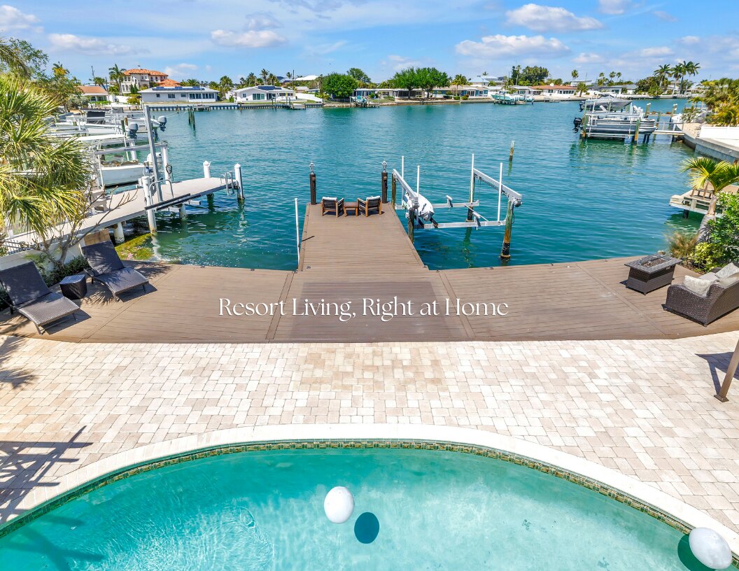
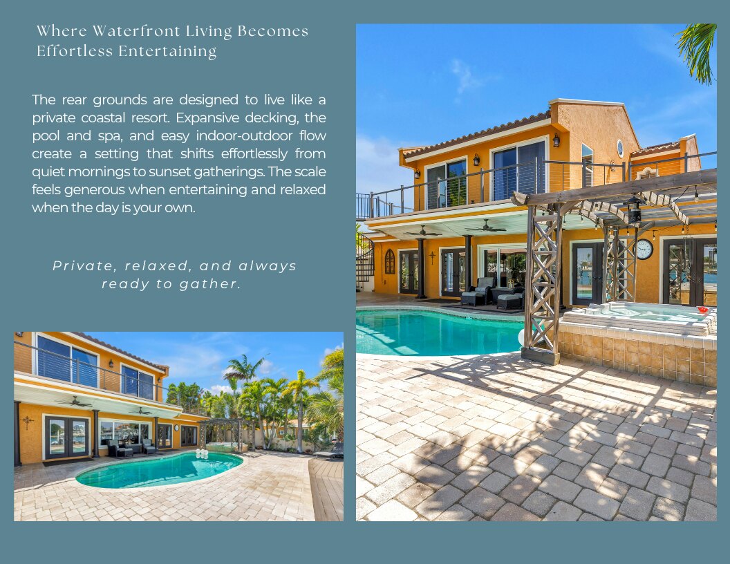
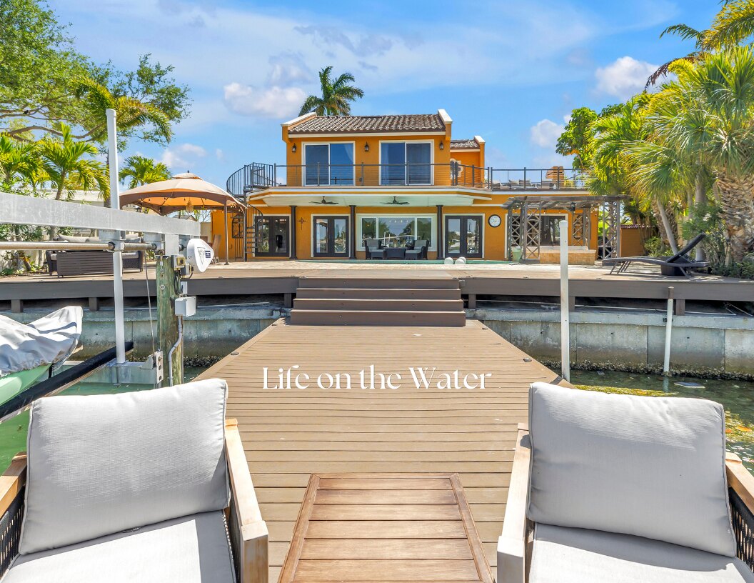
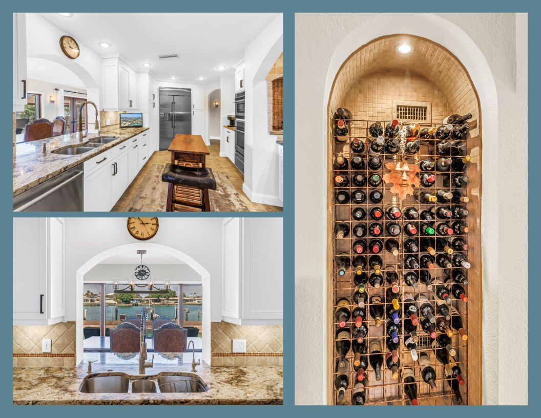
Real listing photography (Krayer Ventures), shot to feel like a clear coastal morning — never stock, never fabricated. Virtual staging is welcome when it's disclosed and true to the real room. The signature device: a single overlaid caption in The Seasons, set in white over the image.
Light
Bright daylight and golden hour. Water reads clear and turquoise. Skies open.
Subject
The home in conversation with the water — docks, pool terraces, balconies, the bay. Drone, interior, and dusk together tell one story.
Overlay
One white Seasons caption per image ("Belle Vista", "Life on the Water"). Quiet, never busy.
Never
Stock models, rooms faked to misrepresent the home, undisclosed AI staging, cluttered or dim frames, heavy filters, competing signage.
08 · Components & Tokens
One source the website inherits.
Buttons and components draw from the same tokens as this guide, so HerrellGroup.com is built from the brand, not a re-interpretation of it.
States. Default as shown · hover: darken fill ~6% · focus-visible: 3px Equator Gold outline, 2px offset · disabled: 60% opacity, no pointer. Radius --radius-pill on buttons, --radius-lg on cards.
Design tokens
Ship as tokens.json with identical names. This is the bridge to the website build.
:root {
  --color-anchor:  #447C8C;  /* Bismark Teal */
  --color-ink:     #1C2E33;  /* Deep Teal */
  --color-accent:  #E0B55E;  /* Equator Gold */
  --color-umber:   #7C4A10;  /* Raw Umber */
  --color-ground:  #FBF6EC;  /* Paper */
  --color-cream:   #F3E3C8;  /* Albescent White */

  --font-display: "The Seasons", "Playfair Display", serif;
  --font-script:  "The Something Script", "Tangerine", cursive;
  --font-body:    "Georgia Pro", Georgia, serif;

  --radius-md: 8px; --radius-lg: 16px; --radius-pill: 999px;
}
09 · Applications
The mark, in the wild.
A worked example: 3945 Poinsettia Dr, Belle Vista, St. Pete Beach — a 5 bed / 3 bath / 2,892 sqft waterfront home — carried across the full system.
Map / pin
The pineapple as the map pin — "the welcome marks the spot."
Badges
SOLD · JUST LISTED · OPEN HOUSE · NEW PRICE circular pineapple seals.
Social
IG grid + 9:16 story, overlaid Seasons captions over listing photography.
Print + email
Postcards, "Lifetime of Happiness" closing notes, email banner.
Transition note: standardize every badge and watermark to The Herrell Group · Real Estate. Retire the legacy "Herrell & Gomez" ring still on some assets.
10 · Lived Brand
Forty years on these islands. Not a tagline — an address.
The Herrell Group is hyperlocal because Tina is. The brand's credibility is the calendar and the map it actually lives on.
The market
St. Pete Beach, Belle Vista, Gulfport, Treasure Island, St. Petersburg. Waterfront and the $1M+ Gulf Coast tier.
The roots
40+ years in Pinellas, USF Business grad, RE/MAX since 2012, RE/MAX Hall of Fame, Luxury Home Marketing. Co-owns a 25-year Pinellas construction company.
The craft partners
Listing media with Krayer Ventures; a steady listing-video cadence; The RE/MAX Collection for luxury listings.
"Tina is amazing at what she does. Found a cash buyer for my waterfront house in one month after the previous realtor had no success after seven. I'm looking to buy in Pinellas again and Tina is the only person I would trust — and I know several realtors in the area."— Jim Sailor (confirm permission before external use)
11 · Editorial Boundary
Editorial boundary with The Gomez Group.
Following the dissolution of the former Herrell & Gomez Group, The Herrell Group operates as an independent brand — its own clients, its own positioning, its own visual system. This section documents how editorial content is produced to stay visually and structurally independent from The Gomez Group at every level.
The boundary principle
At every level — palette, typography, layout, voice, timing — a viewer encountering one piece should not be able to mistake it for the other agent's work. The Herrell Group identity is locked and respected. The Gomez Group identity is locked and respected. This document governs the editorial content layer that sits over each.
Palette boundary
The Herrell Group editorial palette is documented in full in Section 04 — Color & Accessibility: a dark Bismark Teal #447C8C anchor field with an Albescent cream surface. The Gomez Group palette is Gulf-side Nautical — a Sand field #E5DAC4 with Storm Navy #284055 structure, Soft Brass #B89B68 and Copper #A8693D as warm metals. The boundary is carried by field dominance, not hue family: The Herrell Group reads as a dark teal-anchored field; The Gomez Group reads as a light Sand field with Storm Navy structure. One inverts the other.
An honest note on overlap: the two palettes share a warm-metal family — Soft Brass #B89B68 near Equator Gold #E0B55E, Copper #A8693D near Raw Umber #7C4A10 — and Storm Navy #284055 sits near The Herrell Group's Deep Teal ink #1C2E33. These shared families do not hold the boundary. It holds on three differentiators: field dominance, layout signature, and typography (The Herrell Group's serif/sans against The Gomez Group's serif/serif). Warm metals are never to be treated as a differentiator.
The contrast is reinforced by inverted dominance: The Herrell Group uses its teal as the anchor field with a cream surface, while The Gomez Group runs a light Sand field with Storm Navy as the structure.
The Zero-Overlap Test (revised) — the swatch test alone is no longer sufficient, because the palettes share warm metals. The real test is dominance: a dark teal-anchored field reads as Herrell; a light Sand field with Storm Navy structure reads as Gomez. A Herrell piece rebuilt on a light Sand field would read as Gomez even with its teal accents intact, and a Gomez piece on a Bismark-teal anchor would read as Herrell.— The rule of thumb for every parallel piece
Typography boundary
The Herrell Group editorial typography is documented in Section 05 — Typography. The Gomez Group uses Cardo for both display and body (serif/serif). Where The Herrell Group pairs serif display with Manrope sans body for textural contrast, The Gomez Group runs one serif throughout for a warmer humanist voice. Serif/sans against serif/serif is the type-level tell.
Layout boundary
The Herrell Group editorial signature is vertical, numbered, single-column — a magazine sidebar feel. The Gomez Group signature is horizontal, card grid, multi-column — a magazine spread feel. The two are distinct at thumbnail scale, before any text or color is read.
Operating protocol
Six rules govern day-to-day production. They are checked in order at the start of every content session and re-checked before anything publishes.
01 · Same-day parallel content under the Three-Lock Rule
When a topic is genuinely time-sensitive — breaking news, policy votes, market data, rate moves, storms — both agents may publish on the same topic the same day. The boundary holds through three concurrent locks, all of which must clear before a Herrell Group piece goes live:
Lock 01 · Visual
The piece is produced in The Herrell Group editorial system — the palette and typography of Sections 04 and 05, and the layout signature of this section.
Lock 02 · Voice
The piece leads from the Herrell Group voice (Section 06) — the calm authority of long tenure on the water, anchoring in a specific place and unfolding outward.
Lock 03 · Timing
Publication is staggered by a minimum of four hours from any Gomez Group piece on the same topic.
For evergreen content not tied to a specific event — listicles, neighborhood guides, market commentary — a 14-day spacing is maintained between similar pieces.
02 · Distinct angle and voice
Both agents work the luxury market, both serve relocations, both serve waterfront and Gulf Coast buyers. The differentiation is not in market segment — it is in angle and voice. The Herrell Group writes with the calm authority of long tenure on the water. Tina leads with experience and institutional knowledge — the quiet details of buildings, associations, and waterfront communities that come from years of representing them. Pieces tend to anchor in a specific place and unfold outward.
03 · Pre-publish visual lockup check
Before any Herrell Group piece is published, it is laid alongside the most recent Gomez Group piece. If at thumbnail scale the two could plausibly be mistaken for the same office, the new piece is held and revised. On parallel-publication days under the Three-Lock Rule, the lockup check is mandatory and signed off in writing before either piece goes live.
04 · Cross-promotion is opt-in only
No Herrell Group content references, mirrors, or cross-promotes The Gomez Group unless both agents have explicitly requested it for that specific piece. The default state is independence.
05 · Distinct caption voice and signoff
Caption voice, hashtag set, and signoff line are Herrell Group-specific. Captions never include language that signals shared authorship or a coordinated calendar with The Gomez Group.
06 · Escalation and exception
If a situation arises where the boundary may not be feasible — a joint market panel, a shared community event — the exception is named, documented, and approved by both agents before any content is produced. Exceptions are rare by design.
Enforcement
This editorial boundary is the operational standard for all marketing content produced for The Herrell Group under Pelican Panache Marketing. It is reviewed at the start of every content session and re-checked before publication. If The Herrell Group identifies content that breaches the boundary, the breach is acknowledged, the content is paused or revised, and the cause is documented so the same gap does not recur.
Cross-reference
A mirrored section exists in The Gomez Group brand guide, documenting the same boundary from the opposite side.
12 · Governance & Downloads
How the brand stays alive — and what to confirm.
Stewardship
Pelican Panache maintains the system and assets. Tina applies it day to day. Identity changes route through Pelican Panache.
Asset pack
Logo SVGs (all variants + treatments), tokens.json, color swatches, watermark seals, PDF guide. Links must resolve.
Contact
Tina Herrell · 727-251-6630 · tina@tinamoveshouses.com · HerrellGroup.com
Cadence
Living document. Review at each brand milestone and at least twice a year.
Open items to confirm
This is the portfolio edition, v2.1. Before final lock: (1) brokerage — current signage confirms RE/MAX Action First (with The RE/MAX Collection for luxury listings); the 2024 guide's RE/MAX Metro is retired — sweep any legacy references. (2) Font licenses for The Seasons and The Something Script for web, or approve web equivalents. (3) Logo vector exports + tokens.json to replace the inline approximation. (4) Jim Sailor testimonial reuse permission; add one or two more. (5) Photography rights for Krayer Ventures images used as brand assets. (6) Retire legacy "Herrell & Gomez" watermarks.